
Your content library just got more than one way to show up. SoloFire configurations can now run one of three layouts: the classic Standard view, the new hub-style Orbit view, and the new tile-based Grid view. Each one presents the same approved library in a different experience, and you choose the layout per team, not per account. Set it once in your configuration settings and your reps see it on their next sync.
Here's why we built it, what each layout does, and where each one shines.
Why would a folder tree hold some teams back?
Folders are familiar, and for large content libraries they work. But a folder tree comes with two costs.
First, it makes your sales app feel like file storage. Your reps already have a file system. What they need in the field is an experience that points them to the right content without making them think. That's the difference between sales content management and a shared drive with a login.
Second, folders punish smaller libraries. If you're launching a new product, running a focused distributor program, or you simply keep a tight, curated library (which, for the record, is the right instinct), a folder view can look half empty. Your content deserves better than a zero state.
Orbit: your brand at the center
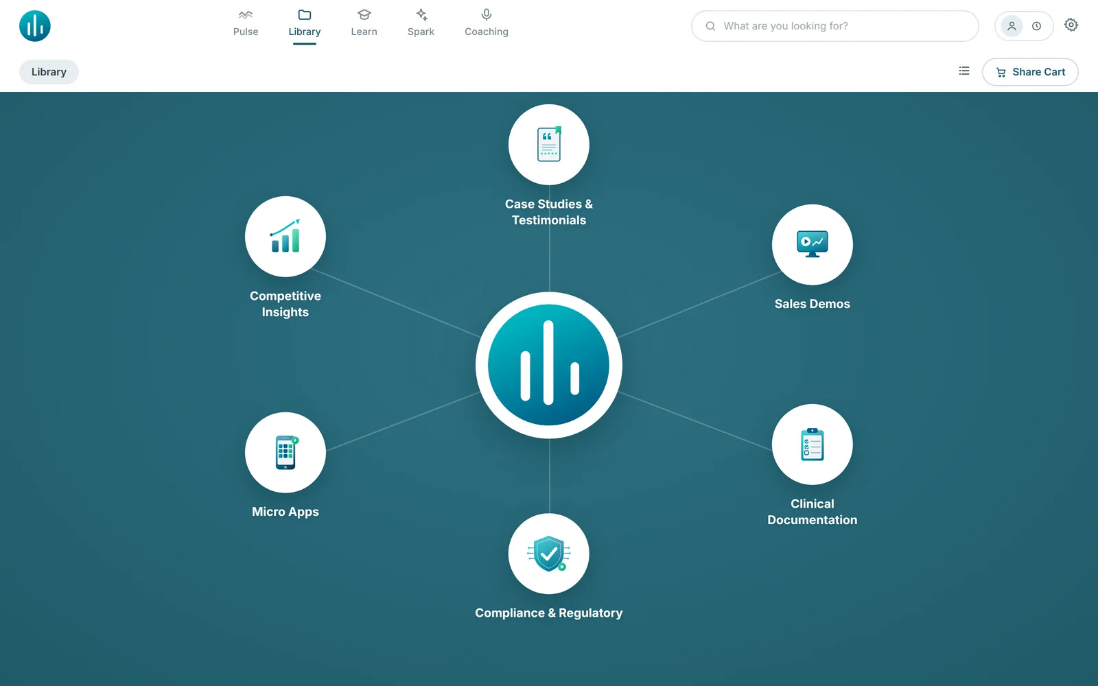
Orbit turns the app's home screen into a hub. Your logo sits in the middle, and your key sections orbit around it: Case Studies, Clinical Documentation, Sales Demos, whatever matters most to that team. Add your own background imagery and brand colors, and the app opens looking unmistakably like yours.
Orbit is at its best when you want navigation to feel effortless and curated. A handful of clear destinations, your brand front and center, and nothing competing for attention. For focused libraries, it turns a few sections into a polished, intentional experience.
Grid: your products, front and center
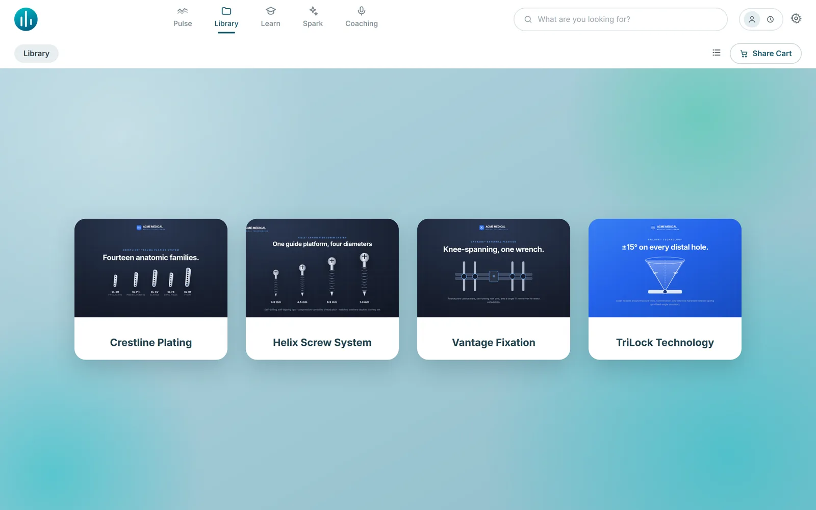
Grid gives you big, visual tiles. Put a hero image on each product line and reps open the app to a wall of your products rather than a list of file names. Tap a product, and everything for that line is organized inside: sell sheets, clinical data, videos, IFUs.
If your organization thinks in product lines, Grid makes the app think that way too. It's also a natural fit for launches: a new product gets a tile the whole field sees the moment they open the app.
Standard: the workhorse, still here
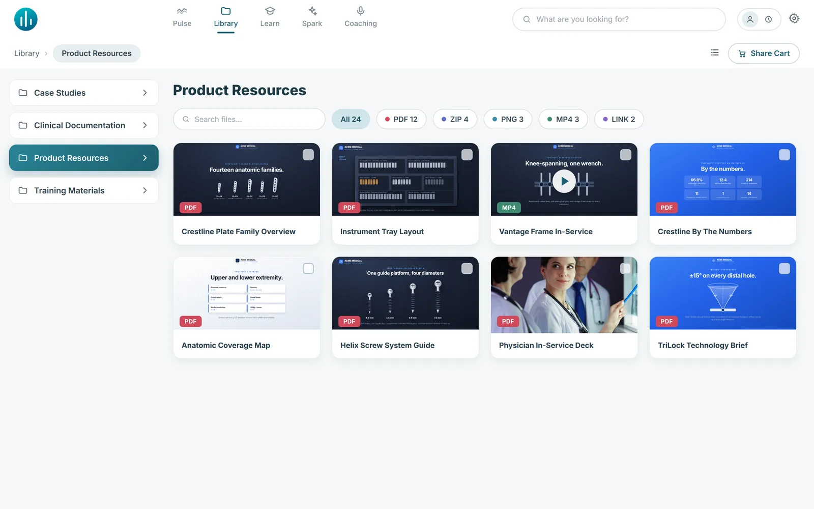
The classic view isn't going anywhere. Full library, folders on the left, content on the right, with search and Spark AI surfacing the right material instantly. For deep libraries and power users, Standard remains the best tool for the job, and if you do nothing, nothing changes.
The last time we changed how the app looks, it was dark mode. This is a bigger idea: not one new look, but the right look per audience.
What if every team could have its own app experience?
This is the part we're most excited about. Layouts are set per configuration, so different audiences get different experiences from the same library.
Your direct US sales force can run the full Standard library. Your distributor group, which sees only the content you've licensed to them, can get a branded Orbit view with three big destinations. A launch team can get a Grid of the new product line. International teams can each get the experience that fits their content.
Same platform, same library, same admin. No duplicated content and no separate systems to maintain. Companies pay agencies six figures for custom branded apps that are outdated within a year; with layouts, you give each audience that custom-app feel from the content you already manage, and it takes about a minute to set up. For channel-heavy organizations, this pairs naturally with sales enablement for distributor networks, where a focused, branded experience is often the difference between distributors adopting your app and ignoring it. We've written before about getting distributors to actually use your platform; giving them an app that looks built for them is a big piece of that puzzle.
What about compliance?
Layouts change presentation, not permissions. Every view draws from the same approved content library with the same access controls and the same tracking. There's nothing new for your regulatory or compliance team to review, because the content itself hasn't changed. Your teams simply experience it in the way that fits them best. That matters in a platform built for medical device field teams, where every asset in front of a customer has to be the approved version.
Available now
Orbit and Grid are live today for web users on SoloFire and coming soon to the mobile and desktop apps. To switch, open your configuration settings, pick a layout, add a background image and brand colors if you'd like, and save.
If you're a SoloFire customer, we're happy to help you pick the right layout for each of your teams. Reach out and we'll set it up with you. And if you're evaluating sales enablement platforms, this is a fun one to see live: we'll show you your own content in all three layouts.